
Events and Workshops
Andy, Amanda, Jeff, and Steve frequently speak about dashboards and data visualization design at conferences and events, host public workshops, and are available for custom private workshops. Bookmark this page to discover upcoming events and workshops where you can learn about how to create dashboards that deliver.
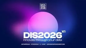
Data Innovation Summit (Nordic)
The Data Innovation Summit is the largest and most influential annual applied Data and AI event in the Nordics and beyond, bringing together the most innovative minds, enterprise practitioners, technology providers, business leaders, start-up innovators and academics, working with Applied Data Innovation, Data Science, Big Data, ML, Applied AI, Generative AI, Data Management, Data Engineering, Architecture, Databases and IoT, in one place to discuss ways to accelerate AI driven Transformation throughout companies, industries and public organisations.
With over 300 Nordic and international speakers in this 11th edition, spread across fifteen stages, seven workshop rooms, 300+ TIP sessions, and plenty of learning and networking activities in the exhibition area, the Data Innovation Summit is the place to be for all professionals and organisations working with utilisation of data and AI innovation for enhancing customer experience, improve operational processes, enable future sustainability, reinventing business models, or developing data-driven products and services.
Andy Cotgreave will be delivering one of the keynotes for this year’s Nordic summit.
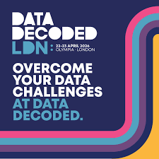
How to Speak Data Workshop @ Data Decoded
Speaker: Andy Cotgreave, Founder, How to Speak Data (Former Senior Tableau Evangelist)
Time: 13:30 - 16:30, 21 April 2026
Location: Hilton Hotel - Olympia, London
Organisations invest in collecting and analysing data. But too often, the value is lost at the final stage: how insights are communicated. If your insights don’t land, minds don’t change. This workshop helps you master the “last mile” of data: how to turn analysis into compelling communication that informs, persuades, and inspires.
Drawing on 20 years of experience, Andy Cotgreave will share proven techniques from design, psychology, and AI. Through examples and hands-on exercises, you’ll learn the core “levers” of visualisation and how to craft charts for different contexts (presentations, dashboards, emails, etc). You’ll leave able to communicate data effectively, whether you’re presenting to executives, building public-facing reports, or reusable data applications.
What We Cover
Visualization Fundamentals: Applying cognitive science to make charts instantly clear.
Design Theory in Practice: Using universal design principles to create powerful, narrative-driven visualizations.
Effective Dashboards: Best practices for structuring and designing actionable, insightful data dashboards.
Presenting Data: Techniques for impactful storytelling, drawing inspiration from masters like Hans Rosling.
The Ethics of Data: Identifying and analyzing deceptive charts and maps to ensure accurate, trustworthy communication.
Participants will leave with the ability to:
Design for Impact: Apply cognitive and design principles to instantly improve any chart or dashboard.
Tell a Story: Structure data presentations that lead audiences to specific conclusions and drive action.
Become a Critical Consumer: Spot misleading and “sneaky” visualizations, enhancing ethical data communication.
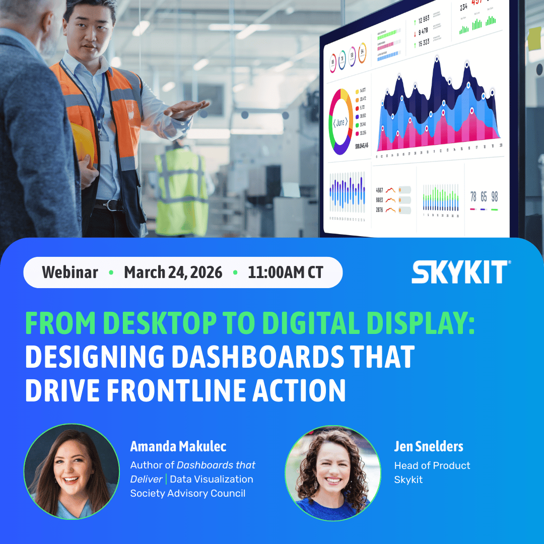
From Desktop to Digital Display: Extending Dashboards to Drive Frontline Action
About this event
Your organization has invested in powerful data dashboards - but if they're sitting behind logins on laptops, the frontline teams who need that information most aren't seeing it. The missing piece is visibility: take dashboards built in Tableau, Power BI, or other BI tools and transform them into action-driving displays that inform and empower teams across your operations.
Join data visualization expert Amanda Makulec, and Skykit product leader Jen Snelders, as they walk through the design principles, security considerations and best practices that help you get started the right way - and build displays that earn attention.
Key Takeaways:
📍 When to use dashboards: identify high-impact use cases across manufacturing, logistics, healthcare, and more.
🎨 How design matters: best practices for data viewed across a facility vs. up close on a screen.
👁️ Where to focus attention: Direct viewers to the metrics that require immediate action.
🚀 How to launch and scale: Proven implementation strategies to get started and grow efficiently.
🔒 Why security matters: Privacy and data best practices for displays in shared environments.
📊 How to measure success: Track dashboard impact and demonstrate ROI.
Register here: https://skykit-1.wistia.com/live/events/a26bydk6hs
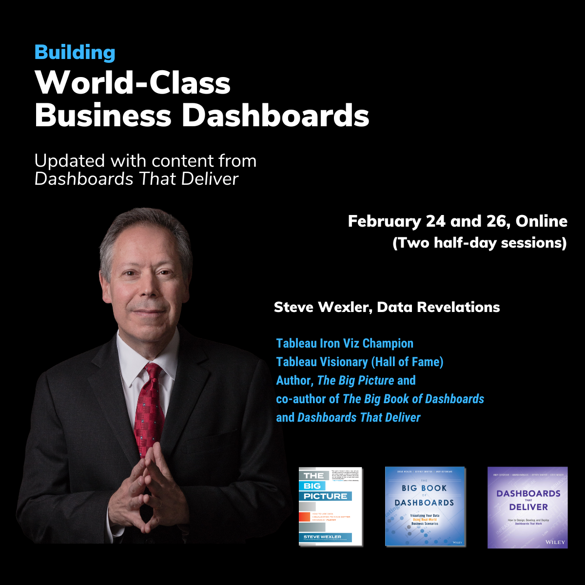
Building World-Class Business Dashboards Workshop
Steve has a workshop coming up on February 24 and 26 (Online).
Click here to learn more.

What do all these images have to do with data visualization and dashboard design?
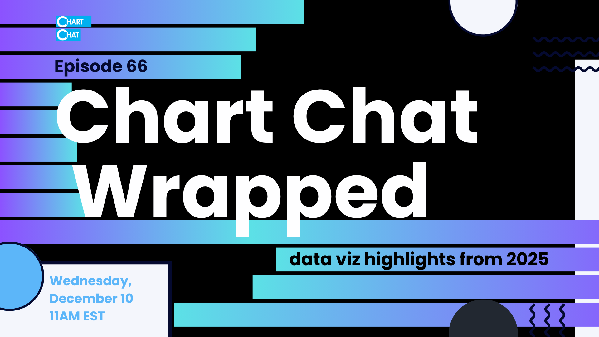
Chart Chat Wrapped 2025
Join us for a year end wrap up of some of our favorite things from the year (besides the book, which we know has been a big Chart Chat topic)!
Retail and Consumer Goods Tableau User Group
Join the Retail and Consumer Goods Tableau User Group for a talk about Dashboards That Deliver with author Amanda Makulec.

Chart Chat #64: Uncharted Territory
If you are into music and data (or music and history, or music and anthropology, or music and politics) this edition of Chart Chat is for you.
We'll be talking with musician, author, and fellow data nerd Chris Dalla Riva about his new book, Uncharted Territory: What Numbers Tell Us about the Biggest Hit Songs and Ourselves.
After spending years listening to every number one hit from 1958 to the present, Chris wrote a data-driven history of popular music. During that journey, he unearthed many unexpected insights:
Hit songs in the 1950s were regularly about gruesome death
It takes twice as many people to write a hit today as it did in the 1960s
The pop charts were rigged in the 1970s
TikTok has made artists more anonymous than ever before
We'll also explore graphic designer Caileigh Nerney's enlightening and entertaining data visualizations that are featured throughout the book.
Join us on YouTube Live: https://www.youtube.com/live/gTFFAj9M54Q?si=P8uLM_GvVfaoT1Kn
Join us on LinkedIn Live: https://www.linkedin.com/events/chartchat-65-numbersandmusicwit7389373631434260481/theater/
As always, stay for the after party where you can ask questions and voice your opinions.

Data Science Europe
Andy will be doing a “Nothing is new in analytics” keynote, explaining how every new trend we see today has echoes from the past. But don’t worry: you’ll still learn the fundamental parts of a data strategy that never change.


Budapest BI Forum
"Dashboards are dead!" cry the AI advocates. But are they? What role does the dashboard have in this age of AI?
In this talk, Andy will explore the changes that AI is bringing to dashboards, and how to adopt Gen AI and traditional dashboards to fit a modern data analytics strategy.

Why Dashboards Still Matter in an AI World
Dashboards were never the goal.
They are a means to understanding.
Today, as AI begins to analyze, generate, and even interpret data for us, the question isn’t whether dashboards still matter. It’s whether we still know how to communicate with data clearly, ethically, and impactfully.
Join Andy Cotgreave, Data Storytelling author, speaker and advisor, and Merav Yuravlivker, Chief Learning Officer at Data Society Group and Co-Founder of Data Society, for a candid conversation about how data storytelling is evolving, and what organizations must do to keep trust at the center.

Chart Chat #64: The Power of Chart Redesigns
Join us and the team from storytelling with data as we dive into the power of redesigning charts and dashboards. We’ll hear about the team’s new book, Before & After, and talk through some of our favorite submissions from the September SWD Challenge, all about dashboard redesigns.

CHI Hack Night: Designing Dashboards That Deliver
Join author Amanda Makulec for a talk about the user-centered, Agile dashboard design framework featured in the new book, along with lessons and ah-ha moments from some of the dashboard scenarios featured.

CHI Data Viz Society & TUG: Five Ways to Actually Understand Your Dashboard Users
Join Amanda Makulec for a deep dive into ways to approach Discovery and actually understand your dashboard users. Then, learn some practical tips you can implement in Tableau to create dashboards that delight!

Data Decoded: Nothing is New in Analytics
Data leaders are continuously promised that new technologies will solve old problems. But an uncomfortable truth exists: whatever the latest tech trend is, the problems don’t go away.
In this eye-opening keynote, Andy Cotgreave offers a sweeping and surprising look at the enduring challenges of building a data-driven organisation. You’ll learn about the four strategic layers that you must align in order to drive change: data, semantics, analytics, and impactful action.
Along the way, you’ll discover parallels between today’s AI-powered tools and decisions faced by data pioneers long before the digital age.
If you’re a data leader tired of chasing the next shiny thing, this session will ground you in what actually works—and what always has.

Twin Cities TUG: Behind the Scenes of Dashboards That Deliver
Join Amanda Makulec for a glance behind the scenes of writing Dashboards That Deliver and ah-ha moments that came from developing a framework scaleable from teams of one to enterprise BI crews.

MKE TUG: Designing Dashboards That Deliver
Join Amanda for an in-person Milwaukee TUG meetup to learn about the Dashboards That Deliver framework, insights from dashboards in the book, and to pick up some book swag!

Designing Dashboards that Deliver Workshop
Many dashboard workshops focus on teaching how to use a specific tool. Or they're focused only on the charts and design decisions, like how to use color, text, and filters to guide your users, that make up what you see on your screen. This workshop is different.
During this workshop, you'll learn how to think like a dashboard design expert and implement a user-centered, Agile approach when designing new dashboards or updating existing ones.
You'll learn from real world scenarios that bring the concepts from Dashboards That Deliver off the page. We'll design a new dashboard through a two day 'design sprint' approach that will keep you on your toes (even though we're not writing python, VizQL, or DAX).
You'll leave with a roadmap you can adapt and implement in your work to develop more effective dashboardes, whether you're working as a team of one or part of a 100+ person analytics team

Why Making Data Meaningful Requires a Human Touch
Join Amanda at the Data Connect Conference in Columbus, OH, hosted by Women in Analytics and partners for a special breakout session with hands on practice.
Why Making Data Meaningful Requires a Human Touch
Today, AI tools promise to answer questions and spin up charts at the click of a prompt. But impactful data visualizations, which connect people with a message and add context to raw numbers, still require a human leading the design decisions.
During this breakout session, we’ll dive into how we create effective data visualizations that make data meaningful by exploring:
Who are we communicating with and who is represented in our data?
How trustworthy are the underlying data and the visualizations that reveal patterns in our data tables?
What design techniques can we use to clearly communicate a data story without venturing into misleading graphics too focused on a specific message?
We’ll work through a design brief that helps us center our design decisions on what our audience needs as we explore these big questions. You’ll leave with a framework for being a more effective, responsible chart consumer and creator, including considerations when exploring how to use new technology, including data visualization software and genAI tools, for communicating data.

Data Culture Club London (Ortecha)
From Ortecha:
“And the theme? Well, we’ve been thinking about communication – how to get people excited about data, and how colleagues can best present their insights – so we’re leaning into our wonderful theatre location to explore Storytelling in Data Culture. Data isn’t just numbers, it’s narratives. The strongest data cultures aren’t built on dashboards alone, but on stories that resonate, inspire and drive decision-making at every level. But how best to get a message across to a diverse audience with different needs, concerns and learning styles? How can we add emotion to dry facts – and how can we measure if it’s working?”

Chart Chat #63
Join us for Chart Chat LIVE with the authors of Dashboards That Deliver. We’ll take your questions and dive into anything you want to know about the new book!

Dashboards That Deliver Launch Webinar with Datacamp
Join us on September 23 to celebrate launch day for Dashboards That Deliver. We’ll share the framework we outline in the book - rooted in our combined 50+ years of experience and dozens of interviews - and insights from real world scenarios.

The Democratization of Data Visualization
Join author Amanda Makulec for a presentation on the democratization of data visualization as part of the expert webinar series for the Pacific Data Visualization Challenge.
Today, anyone can create a chart. The craft of creating data visualizations has shifted from a niche skill set to a growing field of practice and a skill in demand among knowledge workers. Technology platforms that promise the capabilities to spin up interactive charts in minutes abound. At the same time, navigating the world increasingly requires being a thoughtful reader of charts too.
But is this shift towards a democratization of the creation of data visualizations a good thing for chart creators? Or for the world at large, when charts can be used to mislead as well as inform? During this talk, Amanda will map how we got to this moment as an industry and explore the pros and cons of this fourth wave in the world of modern data visualization.
Learn more and register for this free event on the challenge website.

Outlier Conference 2025
Join us at Outlier, the annual conference hosted by the Data Visualization Society.

Building World Class Business Dashboards
Learn how to build world-class business dashboards from the author of the best-selling book The Big Book of Dashboards.
A well-designed dashboard can point out risks, opportunities, and more; but common challenges and misconceptions can make your dashboard useless at best, and misleading at worst. This workshop will discuss the tools, guidance, and models you need to produce great dashboards that inform, enlighten, and engage.
This workshop is for anyone tasked with building or overseeing the development of business dashboards and is applicable to anyone who needs to help others better understand data to make informed decisions.
The workshop will appeal to all levels in the organization, from data analysts to C-Suite executives.
No other workshop presents concepts in data visualization and dashboard design theory with practical, real-world insights from an expert in the field.
Attendees will be able to immediately apply what they learn to their own work.
ROI: Better dashboards lead to better understanding which lead to better decisions.

Building World Class Business Dashboard (Online)
Learn how to build world-class business dashboards from the author of the best-selling book The Big Book of Dashboards.
A well-designed dashboard can point out risks, opportunities, and more; but common challenges and misconceptions can make your dashboard useless at best, and misleading at worst. This workshop will discuss the tools, guidance, and models you need to produce great dashboards that inform, enlighten, and engage.
This workshop is for anyone tasked with building or overseeing the development of business dashboards and is applicable to anyone who needs to help others better understand data to make informed decisions.
The workshop will appeal to all levels in the organization, from data analysts to C-Suite executives.
No other workshop presents concepts in data visualization and dashboard design theory with practical, real-world insights from an expert in the field.
Attendees will be able to immediately apply what they learn to their own work.
ROI: Better dashboards lead to better understanding which lead to better decisions.
Register

Chart Chat Live at Tableau Conference
Join us at Chart Chat live at Tableau Conference 2025 in the Content Pavilion on Thursday, April 17